
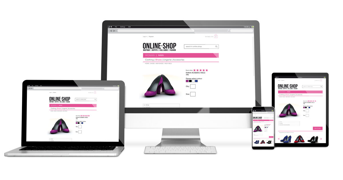
Mobile-first isn't a trend — it's the standard. Google has been using mobile-first indexing since 2021, meaning it evaluates and ranks your website based on its mobile version, not its desktop version. If your mobile experience is poor, your SEO rankings suffer across all devices.
What Mobile-First Design Means
Mobile-first design is a methodology where you design the mobile experience first, then progressively enhance it for larger screens. This is the opposite of the traditional approach (design for desktop, then shrink it down for mobile).
Why does this matter? Because constraints drive better design. When you start with the smallest screen:
- You're forced to prioritize the most important content
- Navigation must be simple and intuitive
- Page load times must be fast (mobile connections are slower)
- Touch targets must be large enough to tap accurately
- Forms must be minimal and easy to complete on a small screen
The Business Impact
Traffic
Over 60% of all web traffic comes from mobile devices. For local businesses — restaurants, dentists, plumbers — that number is even higher, often exceeding 70%.
Conversions
Mobile conversion rates are historically lower than desktop — but that's because most mobile experiences are terrible. Businesses that invest in mobile-first design see mobile conversion rates approach or match desktop.
Local Search
Over 75% of local searches happen on mobile devices. When someone searches "plumber near me" on their phone, they're ready to call right now. If your site loads slowly, looks broken, or has tiny text they can't read, they'll tap your competitor instead.
Key Elements of Mobile-First Design
Responsive Layout
Your site should fluidly adapt to any screen size — phone, tablet, laptop, desktop. Not just two or three fixed breakpoints, but a truly flexible layout.
Touch-Friendly Interface
- Buttons at least 44x44 pixels (Apple's recommended tap target)
- Adequate spacing between interactive elements
- Swipe-friendly carousels and galleries
- No hover-dependent functionality
Performance
Mobile users are often on cellular connections. Optimize for speed:
- Compress and lazy-load images
- Minimize JavaScript
- Use efficient, modern CSS
- Target sub-2-second load times
Readable Content
- Minimum 16px font size for body text
- High contrast between text and background
- Short paragraphs and scannable headings
- No horizontal scrolling
Simplified Navigation
- Hamburger menu or bottom navigation bar
- Clear, descriptive menu labels
- Search functionality for content-heavy sites
- Breadcrumbs for easy backtracking
Mobile-Optimized Forms
- Large input fields
- Appropriate keyboard types (email, phone, number)
- Inline validation
- Minimal required fields
- Auto-fill support
Testing Your Mobile Experience
Use these tools to evaluate your mobile site:
- Google's Mobile-Friendly Test — basic pass/fail assessment
- Google PageSpeed Insights — performance and Core Web Vitals
- BrowserStack — test on real devices and browsers
- Your own phone — the most important test of all
Our Approach
Every website we build starts mobile-first. We design and test the mobile experience before we ever touch the desktop layout. This ensures your site works beautifully on the devices your customers actually use.